Color can transform a space in remarkable ways. If you’ve been feeling that your home needs a fresh touch, this post is for you. I created this guide to showcase 13 aesthetic color schemes that will not only elevate your home’s style but also reflect your personality. Whether you’re starting from scratch or just looking to refresh a room, discovering the right color palette can make all the difference.
This post is aimed at homeowners, renters, and anyone who loves home styling. If you enjoy expressing yourself through decor, you’ll find plenty of inspiration here. You’ll learn about different color schemes, what emotions they evoke, and how to incorporate them into your space. From soft pastels to bold jewel tones, these ideas will help your home pop with newfound energy.
By the end of this post, you will have a clearer understanding of how to choose the perfect color palette that suits your style. You’ll gain practical tips on how to implement these schemes effectively, creating a space that feels uniquely yours. Let’s dive into the vivid world of color palette inspiration!
Key Takeaways
– Explore 13 distinct color schemes that enhance different styles and moods in your home.
– Discover how soft pastels can create a serene atmosphere perfect for relaxation.
– Learn why bold jewel tones make a striking statement and can add glamour to any room.
– Understand the comforting effects of earthy tones and how they can ground your space.
– Get practical tips for mixing and matching colors to achieve a cohesive and stylish look.
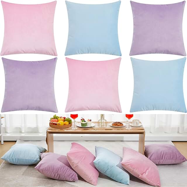
Soft pastels create a serene and soothing environment in your home. The gentle hues of blush pink, light blue, and creamy yellow blend harmoniously, offering a tranquil backdrop that feels both inviting and refreshing. These colors work well in spaces like bedrooms, nurseries, or intimate reading nooks, fostering a sense of calm and relaxation.
To effectively implement this palette, consider pairing pastel shades with warm wood accents or lush greenery, which enhances the airy feel of the space. This combination not only expands visual space but also promotes a comforting atmosphere that resonates with tranquility.
Here are some tips to make the most of this palette: – Use pastel shades on walls and complement with darker furniture for contrast. – Incorporate textiles like cushions and throws in varying pastel tones to add depth. – Consider artwork that showcases pastel hues to tie the room together.
This look is all about soft, inviting vibes that make anyone feel at home, while textures and materials enhance the overall aesthetic.
Bold jewel tones can infuse your home with a sense of luxury and depth. Rich colors like emerald green, sapphire blue, and amethyst purple create a dramatic impact that’s perfect for making a statement in living rooms or dining areas. This color scheme captures attention and adds an element of sophistication that feels timeless.
To balance the intensity of jewel tones, consider integrating lighter accents such as white or gold trims, which can brighten the space. Additionally, metallic decor can enhance the glam factor, creating a beautiful contrast that feels inviting yet luxurious.
Here’s how to use jewel tones effectively: – Use a bold color on an accent wall to create a focal point without overwhelming the space. – Mix and match jewel tones for textiles and decor to enhance the luxurious feel. – Incorporate mirrored or metallic accessories to reflect light and add opulence.
This palette brings a rich, stylish ambiance, elevating your home decor to new heights.
Earthy tones bring the beauty of nature indoors, creating a warm and grounding atmosphere. Shades like terracotta, olive green, and deep browns evoke a sense of comfort and connection to the natural world. This palette is ideal for living rooms and kitchens, where you want to foster a nurturing and inviting environment.
By pairing earthy tones with natural materials such as wood and stone, you can truly embrace the outdoors. This not only enhances the warmth of the space but also creates a cohesive look that feels both stylish and organic.
Tips for using earthy tones: – Paint your walls in a muted earthy shade and contrast with lighter furniture for balance. – Incorporate plants and natural decor to enhance the earthy feel. – Use rugs and cushions in various earthy tones to add texture and warmth.
Embracing this color scheme brings the calm and beauty of nature right into your home.
A black and white palette exudes sophistication and timeless elegance in any space. This classic combination is perfect for those who appreciate a minimalist aesthetic while still making a bold statement. The striking contrast between black and white creates visual interest that enhances everything from modern living rooms to elegant bedrooms.
To keep the look inviting, incorporate various textures and perhaps a splash of color. This approach prevents the design from feeling too stark, allowing for warmth and personality to shine through.
Here’s how to nail the black and white look: – Use white walls as a canvas and incorporate black furniture or artwork to create depth. – Add textures through rugs, cushions, or curtains to make the space feel inviting. – Consider a splash of color, like bright red or gold, to make the black and white combo even more striking.
This palette embodies sophistication and style, making it a timeless choice for any home.
Fun fact: A black-and-white palette can make a room feel up to 20% larger, thanks to strong contrast and clean lines. Pair varied textures—knit throws, velvet cushions, and matte metals—to keep it inviting rather than stark. Style with color palette inspiration to add personality.
– Creates a calm and serene environment, perfect for relaxation.
– Versatile and works well with various decor styles.
– Cons:
– May feel too soft or washed out in larger spaces.
– Can be challenging to pair with bold accents without clashing.
– Best for: Small rooms or spaces where tranquility is desired.
Bold Jewel Tones
– Pros:
– Adds richness and depth, making spaces feel luxurious.
– Great for creating a dramatic and sophisticated ambiance.
– Cons:
– Can be overpowering if used excessively or in small areas.
– Requires careful consideration when pairing with other colors.
– Best for: Living rooms or dining areas meant for entertaining.
Warm Neutrals
– Pros:
– Provides a timeless and inviting feel.
– Pairs easily with almost any color, allowing for flexible styling.
– Cons:
– May appear bland without pops of color.
– Risk of looking dated if not updated with trendy accessories.
– Best for: Family homes where comfort and style are priorities.
Coastal Blues
– Pros:
– Evokes a refreshing and airy vibe reminiscent of the beach.
– Perfect for creating a light and breezy atmosphere.
– Cons:
– Can feel too thematic, limiting your decor choices.
– Might not work in colder climates where warmer tones are preferred.
– Best for: Beach houses or homes looking for an airy, relaxed feel.
Black and White
– Pros:
– Offers a chic and timeless look that never goes out of style.
– High contrast creates a dynamic visual appeal.
– Cons:
– Can come off as stark or cold without warmer accents.
– Requires careful balance to avoid a sterile look.
– Best for: Modern spaces that aim for elegance and sophistication.
Expert Recommendation:
Best Overall: Warm Neutrals
Warm neutrals are our top pick due to their versatility and timeless appeal. They adapt well to changing trends, making them a wise investment for any home styling effort. You can easily layer textures and colors without overwhelming your space. This option is ideal for families and anyone who values comfort while still wanting a stylish environment.
Why We Picked This:
While warm neutrals work well for many people, others might gravitate towards bold jewel tones for a more dramatic flair or coastal blues for a refreshing vibe. Each color palette has its unique charm, so consider what fits your personal style and the atmosphere you want to create in your home. Making an informed choice will enhance your space and reflect your personality beautifully.
Coastal blues evoke a sense of calm and serenity, reminiscent of the ocean’s soothing palette. Shades like seafoam green, sky blue, and sandy beige create a bright and refreshing atmosphere, perfect for beach homes or anyone wanting to bring a touch of seaside tranquility indoors.
To create airy spaces with these colors, consider using them in your living room or bathroom. Adding natural fibers and light wood can further enhance the beachy feel, resulting in a soothing retreat that feels open and relaxed.
To effectively incorporate coastal blues: – Paint walls in light blue or white and add darker accents for depth. – Use light-colored furniture and textiles to keep the space feeling fresh. – Incorporate seashells or nautical decor to enhance the coastal theme.
This color scheme is all about relaxation and bringing the tranquility of the sea into your home.
Warm neutrals create an elegant backdrop that complements every style. Think soft taupe, warm greys, and creamy whites that exude comfort while remaining timeless. This palette is versatile enough for any space, from modern kitchens to classic living rooms, offering a cozy yet sophisticated vibe.
Warm neutrals allow for easy decor transitions, making it simple to refresh your space. By incorporating bolder hues in your accessories, you can add personality while maintaining a cohesive look.
Here are some tips to use warm neutrals effectively: – Use a warm neutral palette for larger furniture pieces to create a cohesive look. – Accessorize with bolder hues in textiles and art to add personality. – Consider different textures, like soft blankets or woven rugs, to enhance warmth.
This palette fosters a cozy yet sophisticated home environment that feels inviting.
Mint and coral create a vibrant and playful color scheme, ideal for lively spaces like kitchens or children’s rooms. The refreshing tones of mint beautifully complement the warmth of coral, resulting in an inviting and energetic environment.
This joyful combination is perfect for those looking for a harmonious yet vibrant aesthetic. To effectively use mint and coral, consider balancing larger areas with mint while using coral for accessories to enhance the overall design.
Here’s how to use mint and coral effectively: – Use mint for larger areas, like walls or cabinets, and coral for accessories to create balance. – Incorporate patterns, like stripes or florals, to bring the colors together effortlessly. – Consider wooden accents to ground the color scheme.
This palette exudes joy and creativity, making your home feel welcoming and bright.
The combination of charcoal and gold brings a luxe contemporary vibe to your home. Dark charcoal serves as a dramatic backdrop, while gold accents provide an elegant touch that feels sophisticated and modern.
This palette shines in dining rooms or entryways where a stylish statement is key. By effectively utilizing this scheme, you can create a space that feels both bold and inviting.
Here’s how to nail the charcoal and gold look: – Paint walls in charcoal and incorporate gold in light fixtures or accents. – Mix textures by pairing smooth surfaces with rough or matte finishes. – Use white decor elements to keep the look from feeling heavy.
This elegant palette is all about making a bold, stylish statement that captures attention.
Charcoal and gold don’t shout for attention—they invite it. This color palette inspiration turns a dining room into a luxe stage where bold depth meets warm glow. It feels modern, inviting, and perfectly livable—just the right balance of drama and charm.
Blush and grey create a soft and romantic atmosphere, perfect for bedrooms or cozy living spaces. The delicate blush contrasts beautifully with the understated elegance of grey, resulting in a serene and inviting environment.
To master the blush and grey look, consider using blush as a gentle accent on walls or bedding, with grey for larger furniture pieces to maintain balance. Adding various textures enhances the depth and warmth of the palette.
Here’s how to create the perfect blush and grey space: – Use blush as a soft accent on walls or bedding, with grey used for larger furniture pieces. – Incorporate various textures to add depth, like soft rugs or plush pillows. – Use warm lighting to enhance the soft colors and create a welcoming ambiance.
This palette is all about creating spaces that feel cocooning and romantic, perfect for relaxation.
Rustic reds and greens bring a warm, homely feel that’s perfect for kitchens and dining areas. These colors evoke the beauty of nature and can help create a cozy farmhouse aesthetic that feels inviting and cheerful.
To effectively use rustic reds and greens, consider choosing deep red accents like curtains or rugs against warm off-white or beige walls. Incorporating natural wood elements enhances the rustic charm, making the space feel grounded and welcoming.
Here are some tips: – Choose deep red accents like curtains or rugs against warm off-white or beige walls. – Incorporate natural wood elements to enhance the rustic charm. – Use greenery in decor to tie in with the color palette, adding life and color.
This palette is ideal for those who love a warm, inviting atmosphere reminiscent of countryside living.
Vintage yellow and grey offer a nostalgic charm that feels both cheerful and sophisticated. The sunny disposition of yellow brightens spaces, while grey adds a timeless touch that balances the vibrancy of yellow. This combination is perfect for sunrooms or vintage-styled rooms, creating a joyful ambiance that uplifts.
To master this palette, consider using vintage yellow on accent walls and combining it with grey furniture or decor. Retro patterns can enhance this nostalgic feel and bring a playful touch to the space.
Here’s how to make the most of this combination: – Use vintage yellow on accent walls and mix with grey furniture or decor. – Add retro patterns for textiles to enhance the nostalgic feel. – Consider using soft, warm lighting to bring out the hues.
This color scheme creates spaces that feel happy and inviting, perfect for relaxation.
Monochrome magic revolves around creating a cohesive look using varying shades of a single color. This approach can be visually striking and allows for unique creativity in textures and patterns, resulting in a sleek, unified aesthetic.
To incorporate monochrome effectively, use varying shades of a color on walls, furniture, and decor to establish depth. Playing with textures by combining shiny surfaces with matte finishes can further enhance the design.
Here’s how to achieve monochrome magic: – Use varying shades of a color on walls, furniture, and decor for depth. – Play with textures, such as combining shiny surfaces with matte finishes. – Add contrasting elements in materials to break up the color and add interest.
This bold approach is a great way to express your style while maintaining a harmonized look.
Fun fact: Monochrome rooms feel up to 40% more cohesive when you mix two shades of the same color with matte and glossy textures—color palette inspiration in action. Start with one wall color, then layer furniture in lighter and darker tones. This trick adds depth and unity.
Bright and eclectic color schemes celebrate individuality and creativity, allowing you to mix vibrant colors in a way that feels exciting and fresh. Combining reds, blues, yellows, and greens can transform any room into a lively space full of personality.
To embrace an eclectic palette, consider using bright colors in areas like children’s rooms or playful living spaces. Mixing different patterns and textures adds to the fun vibe, creating a truly unique atmosphere.
Here’s how to make the most of this style: – Use bright colors in areas like children’s rooms or playful living spaces. – Mix and match different patterns and textures for a fun vibe. – Don’t be afraid to layer colors on walls and furniture for a unique touch.
This style is all about expressing yourself and having fun with color, resulting in a joyful and dynamic home environment.
💡
Key Takeaways
Essential tips from this article
🎨
BEGINNER
Explore Soft Pastels
Incorporate soft pastel colors to create a serene and calming atmosphere in any room.
💎
PRO TIP
Use Jewel Tones Boldly
Add bold jewel tones for a glamorous statement in your decor, perfect for accent pieces or walls.
🌍
ESSENTIAL
Embrace Earthy Tones
Choose earthy tones to ground your spaces and create a warm, inviting environment.
⚫
QUICK WIN
Classic Black and White
Utilize black and white for a chic, timeless look that complements various styles.
🌊
ADVANCED
Incorporate Coastal Blues
Bring in coastal blues for a refreshing vibe that evokes the tranquility of the beach.
🌈
WARNING
Mix Bright Colors Eclectically
Don’t hesitate to combine bright colors for an eclectic and fun look that reflects your personality.
Choosing the right color scheme can breathe new life into your home, making it not just a place to live, but a canvas that reflects your personality and style. With these 13 aesthetic color palettes, you have a variety of inspirational options to transform your space.
So, whether you prefer serene pastels or vibrant jewel tones, it’s all about what makes you feel at home. Try experimenting with these ideas and let your imagination run wild. Happy decorating!
Note: We aim to provide accurate product links, but some may occasionally expire or become unavailable. If this happens, please search directly on Amazon for the product or a suitable alternative.
This post contains Amazon affiliate links, meaning we may earn a small commission if you purchase through our links, at no extra cost to you.
Frequently Asked Questions
What are the best color palette inspiration ideas to elevate home styling with an aesthetic look?
Here are practical color palette inspiration ideas to give your home an aesthetic pop while keeping the look cohesive for home styling.
1) Start with a versatile neutral base like warm gray or creamy white and build with one or two accent colors.
2) Choose an accent color inspired by nature—think sage green, terracotta, or soft blue—to add depth without overpowering the room.
3) Mix warm and cool neutrals to create contrast and interest while keeping harmony.
4) Layer texture and material—wood, textiles, and metal—to expand your palette beyond paint.
5) Tell a color story by repeating key hues in art, cushions, and accessories across spaces for a cohesive look.
How do I choose a color palette that fits my space and personality using color palette inspiration?
Color is a language for your home. Start by evaluating natural light, room function, and existing furniture and art to guide your base mood.
Then pick one or two anchor colors that reflect your personality and a couple of neutrals to balance them.
Test swatches on large wall patches, drapery fabrics, and on your phone with a quick digital mockup to see how the palette feels at different times of day.
Keep refining until the color palette inspiration feels effortless and true to your home styling goals.
Is it okay to mix bold colors with neutrals in a color palette inspiration?
Absolutely. The trick is proportion and placement. Use neutrals as your canvas and bring in bold colors in small doses on walls, textiles, or a single statement piece.
Try a 60-30-10 rule: 60% neutral, 30% main color, 10% accent color.
Repeat the accent across rooms for a cohesive home styling story. This is a good way to keep things aesthetic without overwhelming the space.
What steps can I take to apply a color palette consistently across rooms for cohesive home styling?
Create a simple color map: base neutral, medium tone, and a repeatable accent.
Carry these colors into different elements: paint, textiles, rugs, art, and hardware, so you see the same story across rooms.
Document your palette with a quick mood board and physical swatches to guide purchases, making your color palette inspiration easy to follow in every corner of the home.
How can I test and preview a color palette inspiration before committing to paint or decor?
Preview like a pro: paint large swatches or use peel-and-stick wall samples, lay out textiles, and create a digital mockup to picture the full space.
Observe how the palette changes with lighting from morning to evening, and in artificial light at night.
Take photos and compare them to your mood board; if it still feels right, you’re onto a solid home styling plan built on color palette inspiration.
One thought on “13 Aesthetic Color Schemes That Will Make Your Home Pop with Style!”
Thanks for the great ideas! Did you know that colors can actually affect your mood? For example, blue is often calming, while yellow can make you feel happier!


Thanks for the great ideas! Did you know that colors can actually affect your mood? For example, blue is often calming, while yellow can make you feel happier!