


Home decor trends seem to change every season, but there’s one thing that always stays stylish: neutral color combinations. If you’ve been feeling overwhelmed by the vibrant colors flooding your Pinterest feeds, you’re not alone. I created this post to help you discover the magic of neutral palettes that can transform your space into a serene and inviting haven. After all, sometimes less really is more, and the right mix of soft hues can bring tranquility and elegance to any room.
This guide is for anyone looking to refresh their home decor without diving into bold and loud colors. Whether you’re a decor enthusiast or just starting your journey, you’ll find something that speaks to your aesthetic sense here. If you appreciate stylish, calming environments, you’re in the right place. With these 19 stunning neutral color combinations, you’ll be inspired to rethink your space and maybe even embrace that #6 combination, which I can confidently say is a must-try!
By diving into these stylish ideas, you will gain insight into how to blend various neutral shades seamlessly. You’ll learn how to create a harmonious atmosphere that feels both chic and comfortable. Say goodbye to the fear of boring decor, and hello to a world of elegant possibilities!
Key Takeaways
– Discover 19 neutral color combinations that can elevate your home decor from ordinary to remarkable.
– Each combination is designed to evoke a specific mood, helping you create the desired ambiance in your space.
– Neutral palettes can be both stylish and functional, making them perfect for any room in your home.
– You’ll find practical suggestions on how to incorporate these colors effectively without feeling overwhelmed.
– Embrace the beauty of subtlety and learn why less can truly create a more inviting and peaceful home.
1. Warm Beige and Soft White

The warmth of beige combined with soft white creates an inviting and serene atmosphere that feels effortlessly stylish. This pairing works wonderfully in living spaces, allowing for a bright and airy vibe that feels both cozy and spacious. Consider using rich materials like linen for your beige furnishings and crisp cotton for your soft white walls to enhance this aesthetic. You can easily incorporate these colors through furniture and decor to create a harmonious space.
To fully embrace this palette, consider these practical tips:
– Use beige for large furniture pieces like sofas or armchairs, while keeping walls a soft white for contrast.
– Layer textures with plush throws and a mix of linens and wools to add depth.
– Incorporate natural wood elements for a grounding effect.
Transform your space with these key elements:
– A light beige sofa
– A white shag rug
– White ceramic vases
– Beige and ivory cushions.
This combination is ideal for a serene living room or a cozy reading nook, creating a stunning focal point in any home.
How To Choose Stylish Neutral Color Combinations for Your Home
Choosing the right neutral color combinations for your home can completely transform your space. With a wide array of options available, it’s essential to focus on specific factors to ensure you achieve the aesthetic you desire. Here’s a handy guide to help you make informed decisions.
1. Consider Your Space
Start by evaluating the size and layout of your rooms. Light colors can make a small room feel airy and spacious, while darker shades can add depth and coziness. For instance, if your living room is on the smaller side, opt for soft whites or light grays that can open up the space. Conversely, if you have a large, open area, bold neutrals like deep taupe or charcoal can create a warm and inviting atmosphere.
2. Think About Lighting
The type of lighting in your home plays a crucial role in how colors appear. Natural light can brighten and enhance soft shades, making them feel more vibrant. In contrast, artificial light can give colors a different tone. Test your chosen colors on the walls at different times of day to see how they look in both natural and artificial light. A color that seems perfect in daylight might look entirely different under warm incandescent light.
3. Create Contrast
When selecting neutral color combinations, it’s essential to consider contrast. Pairing lighter shades with darker hues can create visual interest and depth. For example, a combination of creamy ivory and deep charcoal can be both chic and sophisticated. Additionally, consider using textures to add dimension, such as pairing a soft beige couch with dark wood furniture.
4. Personal Style Matters
Think about your personal style and how you want your home to feel. Are you aiming for a modern aesthetic or a more traditional vibe? If you prefer a contemporary look, sleek grays and whites may work best for you. On the other hand, if you love a cozy, rustic feel, consider warm beige and terracotta. Always choose colors that resonate with your personal taste, as you’ll want to live with them for years.
5. Test with Samples
Before committing to a color, obtain samples and test them in your space. Paint swatches on the wall and observe how they look against your furniture and decor. This step will help you visualize the final outcome and ensure the combination complements your existing elements. You might be surprised how different a color looks once it’s on the wall versus in a sample card.
6. Think About Functionality
Consider the purpose of each room when selecting colors. For instance, a calming palette of soft grays and blues may be perfect for a bedroom, promoting relaxation. In contrast, vibrant neutrals like warm beige and olive green might suit a lively dining area. Tailoring your color choices to the function of each space will enhance both aesthetics and comfort.
Pro Tip:
Always consider your existing decor and furniture when selecting colors. Bring in fabric samples or photos of your furnishings to ensure that the colors you choose harmonize well with your overall design vision.
By keeping these key factors in mind, you can confidently select neutral color combinations that not only elevate your home’s style but also create a space that feels inviting and uniquely you. Whether you are drawn to soft pastels or deeper shades, the right combination can breathe new life into your decor. Start experimenting and enjoy the process of transforming your space!
2. Taupe and Dusty Rose

Combining taupe with dusty rose introduces a sense of elegance and warmth that can elevate any space. Taupe serves as a sophisticated backdrop while dusty rose adds a delicate, inviting touch. This color duo is particularly enchanting in bedrooms or intimate spaces, where a relaxing ambiance is essential. You can explore various materials, such as soft cotton for bedding and luxurious velvet for accents, to bring this palette to life.
Here are a few ways to incorporate this beautiful combination:
– Use taupe for walls or major furniture pieces, and add dusty rose in accessories like curtains and bedding.
– Create an accent wall in taupe, complementing it with soft rose decor.
– Employ varied textures, such as velvet and linen, to enhance visual interest and warmth.
Consider these elements to enhance your design:
– Taupe accent wall
– Dusty rose bedding
– Velvet cushions
– Rose-patterned wall art.
This pairing is particularly stunning in spaces designed for relaxation, as it effortlessly balances warmth and sophistication.
3. Gray and Warm Wood Tones

The combination of gray and warm wood tones strikes a perfect balance of modern sophistication and natural warmth. Gray adds a sleek touch, while warm wood accents create a welcoming atmosphere that makes any space feel comfortable. This palette shines in open-concept areas where distinct zones can be established without sacrificing unity. Think of pairing soft gray walls with rich wood furniture for a cohesive look.
To implement this stylish pairing effectively, consider:
– Choosing a light gray palette for walls or larger furniture to maintain an airy feel.
– Incorporating warm wood accents through coffee tables or shelving.
Key elements to consider include:
– Light gray walls
– Warm wood coffee table
– Wood open shelving
– Gray upholstered chairs.
This combination is perfect for dining areas or living rooms where a modern yet cozy feel is desired.
4. Ivory and Sage Green

Ivory paired with sage green creates a refreshing and calming color scheme that is perfect for spaces dedicated to relaxation. The lightness of ivory brightens the space, while sage green connects your indoors to nature, promoting tranquility. This palette is particularly effective in bathrooms or kitchens, where a soothing atmosphere is desired. You can enhance this combination with natural materials like wood and plants for a harmonious effect.
Here’s how to incorporate these colors:
– Use ivory for walls or larger furniture, while adding sage accents through throws and vases.
– This color scheme is beautiful in bathrooms and kitchens, providing a touch of serenity.
Consider these elements to make the most of this palette:
– Ivory cabinetry
– Sage green vases
– Soft green towels
– Natural wood accents.
This pairing is perfect for any area where you want an uplifting yet soothing atmosphere.
5. Cream and Terracotta

The combination of cream and terracotta brings warmth and a natural feel to your home, making it feel inviting and comforting. This duo is especially suited for kitchens and dining areas, where a welcoming atmosphere is essential. The soft cream tones balance beautifully with the rich, earthy hues of terracotta, creating a harmonious environment. You can enhance this palette with rustic elements like wooden tables and ceramic dishes.
To implement this color scheme, consider:
– Using cream for cabinetry or walls while highlighting terracotta in pottery or tiles.
– Incorporating natural fibers in table settings to amplify the earthy vibe.
Keep these elements in mind for your design:
– Cream cabinets
– Terracotta pottery
– Natural fiber table runners
– Earth-toned dishware.
This combination sets the stage for a warm, inviting kitchen or dining area where family and friends feel at home.
Fun fact: Neutral color combinations in kitchens, especially cream with terracotta, boost perceived warmth by up to 40%. This makes meals feel cozier and spaces more inviting.
📹 Related Video: How To Combine Colors In Your Home & Look Cohesive (6 Tricks Designers Use)
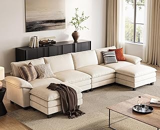
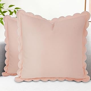
6. Soft Gray and Blush Pink (A Must-Try!)

Soft gray and blush pink create a charming and delicate aesthetic that feels both modern and inviting. This combination has become increasingly popular, particularly in bedrooms and living areas where tranquility is key. The subtlety of soft gray complements the warmth of blush pink beautifully, making it easy to introduce through various materials like soft linens and plush textiles.
To bring this pairing to life, you might:
– Use soft gray for walls or larger furniture, while incorporating blush pink in cushions, artwork, or a statement chair.
– Add metallic accents, such as gold or rose gold, to elevate the sophistication of the space.
Consider these elements for a cohesive look:
– Soft gray walls
– Blush pink cushions
– Metallic decor accents
– Layered gray rugs.
This pairing is a must-try, especially for spaces designed for relaxation and rejuvenation.
Soft Gray and Blush Pink (A Must-Try!)
Editor’s Choice


7. Sandy Beige and Deep Charcoal

Sandy beige and deep charcoal create a stunning contrast that feels both modern and sophisticated. This combination works beautifully in living rooms, dining areas, or home offices where style meets function. Sandy beige brings warmth, while deep charcoal adds depth and drama, making your space feel both inviting and chic. Accentuating this pairing with varied textures can enhance the overall design.
To effectively use this combination, try:
– Using sandy beige for larger furniture to create a light and airy atmosphere, while deep charcoal serves as an accent wall or statement piece.
– Mixing textures, like a chunky beige knit throw with sleek charcoal finishes, to add visual interest.
Key design elements to consider:
– Sandy beige sofa
– Charcoal accent wall
– Textured throws
– Metallic accessories.
This palette is ideal for anyone looking for a bold yet balanced look in their spaces.
8. Soft Lavender and Cream

Soft lavender combined with cream offers a charming and serene atmosphere that feels uplifting and airy. This duo is perfect for creating a light and welcoming vibe, making it an excellent choice for bedrooms or nurseries. The gentle hues blend beautifully, imparting a sense of calm that is essential for restful spaces. You can enhance this palette with fluffy rugs and delicate decor to complete the look.
Consider these decor suggestions:
– Use cream for walls or larger furniture, while incorporating soft lavender in bedding and decorative pillows.
– Add fluffy lavender rugs to enhance softness and create a cozy ambiance.
Key elements to include:
– Cream furniture
– Lavender bedding
– Soft rugs
– Floral accents.
This charming color duo is perfect for areas dedicated to unwinding and tranquility.
You might also like


9. Cool Gray and Soft Mint

Cool gray paired with soft mint creates an elegant and refreshing vibe that feels modern and inviting. This combination works well in bathrooms or kitchens, where a clean and crisp aesthetic is desired. The soft mint adds a pop of color against the neutrality of gray, making the space feel bright and airy. You can easily integrate this palette with materials like ceramic tiles and soft textiles for a cohesive look.
To implement this combination effectively:
– Use cool gray tiles for flooring, while soft mint can be incorporated in towels and decorative elements.
– Consider adding natural wood accents to warm up the space and create balance.
Key design elements to consider:
– Cool gray tiles
– Soft mint accessories
– Natural wood accents.
This palette is perfect for modern bathrooms or stylish kitchens seeking a clean, fresh look.
10. Beige and Olive Green

The pairing of beige and olive green creates a rich, earthy aesthetic that feels nurturing and grounded. This combination is particularly effective for spaces aimed at fostering a natural, organic vibe, perfect for living rooms or dining areas. The soft warmth of beige balances beautifully with the deeper tones of olive green, making it easy to integrate natural materials throughout the decor. You can use wood and stone accents to enhance this palette further.
Consider these tips for incorporating this combination:
– Use beige for larger furniture pieces while adding olive green in smaller accents like throw pillows or artwork.
– Natural materials like wood and stone can beautifully complement this palette.
Elements to include for a cohesive design:
– Beige sofa
– Olive green throw pillows
– Wooden accents.
This combination is ideal for creating an inviting atmosphere, especially in spaces where families gather.
11. White and Charcoal Gray

White and charcoal gray create a striking visual contrast that feels both sophisticated and modern. This combination is perfect for those who appreciate a minimalist aesthetic infused with elegance. White serves as a clean backdrop, allowing charcoal gray to shine through in furniture and decor, creating a balanced look. Incorporating sleek lines can elevate the overall modern vibe of the space.
To achieve this aesthetic, consider:
– Using white as the primary color for walls and larger pieces, while charcoal gray can be introduced as accent walls or furniture.
– Incorporating metallic accents to soften the contrast and add warmth to the space.
Key elements to include:
– White walls
– Charcoal gray furniture
– Metallic decor accents.
This palette is ideal for anyone looking to maintain a modern edge in their decor.
12. Cream and Gold

Combining cream with gold exudes an air of luxury and sophistication. This color palette is perfect for spaces where a touch of glamour is desired, such as dining rooms or entryways. Cream provides a soft, inviting backdrop, while gold accents introduce an element of elegance and warmth. You can enhance this look with varied textures to create a rich and inviting atmosphere.
To implement this combination effectively:
– Utilize cream for walls and larger furniture, integrating gold in light fixtures, decorative accents, and textiles.
– Mixing varied textures, such as velvet and silk, enhances the richness of this palette.
Key elements to consider:
– Cream walls
– Gold light fixtures
– Textured fabrics.
This combination invites warmth and sophistication, creating a beautiful atmosphere for entertaining.
Fun fact: Cream walls with gold accents can make a dining room feel about 30% more luxurious. Layer textures and warm lighting to let the gold glimmer and the cream breathe—it’s the small details that create real glamour in neutral color combinations.
Cream and Gold
Editor’s Choice


13. Soft Beige and Accent Coral

Soft beige paired with vibrant coral accents brings warmth and liveliness, igniting joy in your home. This cheerful combination is perfect for family rooms or play areas, where a welcoming environment is essential. The neutral tones of beige provide a calm backdrop, while coral adds a lively pop of color that enlivens the space. You can easily introduce these colors through fabrics and decor for a fresh look.
Here are some design ideas to consider:
– Use beige for larger furniture or walls, and introduce coral through decorative pillows, artwork, or playful accessories.
– Layer different textures to keep the aesthetic inviting and lively.
Consider these elements to enhance your design:
– Beige sectional
– Coral throw pillows
– Bright art pieces.
This palette is ideal for creating vibrant yet calming spaces where families feel comfortable and happy.
14. Pale Gray and Apricot

Pale gray combined with apricot creates a soft, sunny atmosphere that feels fresh and inviting. This combination is particularly effective in kitchens or breakfast nooks, where warmth and cheerfulness are essential. The gentle contrast between cool gray and warm apricot provides a beautiful balance, making the space feel bright and airy. You can enhance this palette with natural light and soft materials for a cozy vibe.
To make the most of this color scheme:
– Use pale gray for cabinetry or walls, and accentuate with apricot in decor items like cushions and tableware.
– Keep window treatments light and airy to maximize natural light.
Key elements to consider:
– Pale gray cabinetry
– Apricot cushions
– Bright tableware.
This palette invites cheerfulness, making it perfect for creating sunny, uplifting spaces that feel both modern and cozy.
Pale Gray and Apricot
Editor’s Choice


You Might Also Like


15. Taupe and Soft Butter Yellow

The pairing of taupe and soft butter yellow creates a warm and welcoming environment reminiscent of sunny days. This color scheme is perfect for living spaces or dining rooms, where relaxation and comfort are key. Taupe serves as a neutral base, while soft butter yellow adds a cheerful touch, bringing warmth to your home. You can enhance this palette with textiles and decor that highlight both colors beautifully.
To implement this combination effectively:
– Use taupe for bulkier furniture pieces, incorporating soft butter yellow in accents like artwork or floral arrangements.
– This palette plays well with natural light, enhancing the inherent warmth of both colors.
Key elements to include:
– Taupe sofa
– Butter yellow accents
– Natural light fixtures.
This combination creates a harmonious balance of warmth and softness, perfect for inviting comfort into your living spaces.
Taupe and Soft Butter Yellow
Editor’s Choice


16. Light Gray and Lavender

Light gray combined with lavender creates a soft and elegant atmosphere that is perfect for bedrooms and other restful spaces. This palette invites tranquility while providing a gentle splash of color, making it ideal for creating serene environments. You can enhance this look with layered textures and soft furnishings for an inviting feel.
To make the most of this combination:
– Use light gray for walls or major furniture, while accenting with lavender in linens, curtains, and decorative accessories.
– Layering various textures will add depth and comfort to the overall design.
Key features to consider:
– Light gray walls
– Lavender curtains
– Soft rugs.
This palette is perfect for creating restful spaces where comfort meets style.
17. Cream and Dusty Blue

Cream paired with dusty blue creates a soothing and serene atmosphere that is ideal for relaxation-focused spaces, such as bedrooms or reading nooks. The soft tones blend beautifully, evoking a sense of calm that is essential for unwinding. You can easily integrate natural materials like wood and linen to enhance this tranquil palette.
For practical implementation, consider:
– Using cream for larger furniture and walls, while incorporating dusty blue in accent pieces like cushions or throws.
– Maximizing natural light to enhance the gentle hues and make the space feel open and airy.
Key design elements to include:
– Cream furniture
– Dusty blue decor
– Natural light accents.
This combination is perfect for creating peaceful environments where you can relax and recharge.
18. Charcoal and Soft Peach

Charcoal gray combined with soft peach creates a beautiful contrast that feels modern yet warm. This color combination is perfect for living rooms or dining areas, where you want to evoke sophistication without sacrificing comfort. The depth of charcoal pairs beautifully with the gentle warmth of soft peach, creating an inviting atmosphere. You can enhance this look with varied textures and materials to keep it visually appealing.
To implement this combination, consider:
– Incorporating charcoal in larger furniture pieces and walls while using soft peach for accents in cushions, art, or decor.
– Employing a mix of textures, such as plush fabrics and sleek finishes, to maintain visual interest.
Key features to include:
– Charcoal furniture
– Soft peach accents
– Textured decor elements.
This palette is a great option for those looking to make a statement while maintaining a cozy feel.
Fun fact: charcoal and soft peach are standout neutral color combinations that can visually expand a small living room while staying modern and warm. Try pairing charcoal walls with peach accents—cushions, art, and textiles—to keep it inviting, sophisticated, and incredibly practical.
Charcoal and Soft Peach
Editor’s Choice


19. Beige and Ice Blue

Beige and ice blue create a soft, airy feel that is perfect for coastal or beach-inspired designs. This combination evokes feelings of tranquility and serenity, making it ideal for spaces like bedrooms or sunrooms. The delicate shades of beige and ice blue work together to create a soothing atmosphere, reminiscent of sandy shores and clear skies. You can enhance this palette with natural materials like driftwood and linen for a cohesive look.
To implement this combination effectively:
– Use beige for larger elements like furniture, while incorporating ice blue in accessories such as cushions, rugs, and artwork.
– Ensure that natural light enhances the delicate shades, creating a bright and expansive feel.
Key elements to consider:
– Beige furniture
– Ice blue accents
– Natural materials.
This combination is perfect for anyone looking to bring a breath of fresh air into their home decor.
Conclusion

Exploring the world of neutral color combinations opens up endless possibilities for transforming your home. Each hue and shade tells a story, creating the perfect backdrop for your personal style and decor.
Incorporating these 19 stylish combinations can elevate your spaces into havens of tranquility and style. Whether you opt for the warm embrace of taupe and dusty rose or the serene vibes of soft gray and blush pink, your home will surely reflect the magic of neutral decor.
Note: We aim to provide accurate product links, but some may occasionally expire or become unavailable. If this happens, please search directly on Amazon for the product or a suitable alternative.
This post contains Amazon affiliate links, meaning we may earn a small commission if you purchase through our links, at no extra cost to you.
Frequently Asked Questions
What are the top neutral color combinations to try for a stylish living room?
Here are go-to neutral color combinations that feel aesthetic and stylish for a modern living room.
Creamy white with warm beige and charcoal accents adds depth while keeping the space bright.
Greige with ivory and black hardware brings a sophisticated contrast without overpowering the room.
Soft taupe with oatmeal and light wood tones creates a timeless, cozy vibe.
As noted in the article, #6 is a must-try to achieve a bold yet versatile look in a neutral palette.
How can I use neutral color combinations in small spaces to look bigger and more cohesive?
Small spaces benefit from light neutral color combinations that reflect light and create continuity.
Choose whites or ivory as a base, add warm or cool neutrals for depth, and keep ceilings bright to increase perceived height.
Layer textures like linen, wool, and jute, and incorporate mirrors or glass surfaces to bounce light. Consistently repeat undertones across furniture, walls, and textiles for a cohesive look.
How can I add color and personality while staying within neutral color combinations?
Even within neutral color combinations, you can infuse personality through texture, pattern, and art.
Select fabrics with subtle patterns and a mix of matte and satin finishes to add interest without color conflicts.
Introduce accent pieces in your chosen neutral family, and let a few bold artworks or decorative objects serve as focal points. This keeps the space aesthetic and stylish while staying neutral.
What neutral color combinations work best with different design styles like minimalist Nordic or industrial?
For minimalist and Nordic styles, opt for creamy whites, light grays, and natural wood for a calm aesthetic.
Try ivory walls with greige accents and oak furniture for a timeless, clean look.
Industrial spaces shine with charcoal or slate neutrals paired with warm beige tones and metal accents; balance these with texture to keep the space cohesive.
How can I keep a cohesive look across multiple rooms using the same neutral color combinations?
Start with a single base neutral across walls and carry its undertone into trim, flooring, and textiles.
Use a swatch board or digital palette to compare undertones and finishes side by side, ensuring consistency.
Repeat the same neutral color combinations through furniture textures, art frames, and accessories, and choose a few unifying accent pieces to tie rooms together.
Related Topics
neutral color combinations
home decor
minimalist design
aesthetic interiors
stylish palettes
easy updates
color theory
earthy tones
modern elegance
beginner friendly
trending designs
cozy aesthetics