


Is your space stuck in the same old look? I hear you. A Rococo vibe can feel fancy and far away, yet color is a tool you can use.
I made this post because I want to help you bring Rococo charm into real rooms without a big remodel. You’ll find 13 color schemes you can actually try.
If you love soft pastels, gilded details, and rooms that glow with warm light, this is for you. If you rent or live in a small space and want quick, affordable updates, you’re in the right place.
Here’s what you’ll get. Practical guidelines, simple color rules, and tips to apply them to walls, fabrics, and art. You’ll also learn how to test swatches and avoid big missteps. And yes, the #7 scheme will surprise you.
Start with quick wins. Pick one area like a couch pillow or curtains. Think powder blue walls with cream trim. A blush pink sofa with gold frames completes the look. Add a damask rug or velvet throw for texture.
Let this guide become your mood board. See which palette makes the light feel warmer and which textures gleam. Use the ideas as a map for shopping, DIY projects, and small updates.
1. Soft Lavender and Cream

Soft Lavender and Cream
You want a Rococo look that feels calm, not loud. The soft lavender and cream combo is a perfect match. Lavender brings a light, dreamy touch. Cream keeps the room grounded and elegant. This pair creates a serene space you can relax in or share with a loved one. Here is why it works and how to pull it off in real rooms.
– Use lavender in bedding or drapes to wash the room in soft color.
– Paint walls or choose cream furniture to keep the space light and refined.
– Add gold or brass accents through picture frames or decorative mirrors.
– Mix textures like velvet cushions with a cream chaise for depth.
– Add floral patterns to soften shapes and add movement.
– Choose lighting that flatters the palette. Warm white bulbs work well. A small chandelier adds Rococo charm without overpowering lavender.
Next steps to tune the look. Test swatches in your room’s light, not just in the store. Bring in a rug or throw to see how the colors feel at different times of day.
Next steps: collect fabric samples, create a tiny mood board, and plan a simple room arrangement. With careful lighting and careful placement, this Rococo color scheme becomes a calm retreat.
A soft lavender and cream palette can transform any room into a serene escape – perfect for unwinding or sharing special moments. Embrace the calm with these Rococo color schemes!
1. Soft Lavender and Cream
Editor’s Choice

HYMOKEGE Lavender Queen Comforter Set Seersucker 7 Pieces, All Season Lu…

Karl home Accent Chair Mid-Century Modern Chair with Pillow Linen Fabric…

Sweetcrispy Gold Round Wall Mirror 24 Inch, Bathroom Mirrors for Over Si…
2. Blush Pink and Charcoal

Blush pink and charcoal create a Rococo look that feels fresh and timeless. You get softness from blush and depth from charcoal. This combo works best in living rooms and dining areas where you want a calm, confident impression.
Use blush on large, inviting pieces. Charcoal can anchor the space on walls, shelves, or the legs of furniture. A charcoal feature wall behind a blush sofa makes the room feel larger.
Add metallic touches for luxury. A chandelier with brass or champagne tones, gold-trimmed frames, or sleek metal lamps lift the palette without dulling its charm.
Ways to apply:
– Use blush in big furniture pieces.
– Accent with charcoal on walls or smaller items.
– Metallic fixtures tie the look together.
– Choose artwork that blends these colors.
Practical tips: test a small blush swatch near a window to see daylight color. Avoid too many busy patterns; keep fabrics simple so pink stays soothing. If you want more contrast, swap charcoal for near-black to sharpen edges.
Next steps: pick a blush base fabric, plan a charcoal wall or cabinet, and line up lighting and metal accents. This approach gives you a chic Rococo vibe that feels modern, warm, and inviting.
2. Blush Pink and Charcoal
Editor’s Choice

Velvet Sofa Couch for Two People, Modern Loveseat for Living Room Bedroo…
Rust-Oleum 369387 Advanced Dry Door & Trim Paint, Quart, Satin Alpine Gray

GLOBE Electric x Novogratz 67347 22″ 2-Light Table Lamp, Metallic Dark G…
3. Seafoam Green and Gold

If you want a Rococo look that feels elegant but not loud, try seafoam green with gold. This combo hints at the coast while keeping a refined style. It works best in bathrooms or sunrooms where a fresh, light mood helps you unwind.
Here is why this pairing works. Seafoam green soothes the eyes and invites calm. Gold brings a warm glow that echoes classic Rococo details. Together, they read as sophisticated and inviting, even in small spaces.
Here is how to apply it:
– Use seafoam on walls or cabinetry to set a soft, airy backdrop.
– Add gold through faucets, mirrors, lighting fixtures, or hardware for that luxe sparkle.
– Balance the look with natural touches like potted plants, woven baskets, and light wood accents.
– Finish with art or textiles that feature both colors to tie the room together.
Tips to get it right:
– Choose warm or brass-gold tones to create a friendly glow.
– Keep the seafoam as the dominant surface and use gold as accents.
– Play with lighting to avoid dullness or glare. A mix of natural daylight and warm bulbs helps the colors sing.
Next steps: test small swatches on a wall or a cabinet door, then layer in texture and lighting. You’ll see the space brighten without losing the Rococo charm.
A touch of seafoam green and gold creates an oasis of calm and sophistication. Elevate your space and unwind in style – because elegance can be refreshing, too!
3. Seafoam Green and Gold
Editor’s Choice

Cobbe Brushed Gold Bathroom Faucets, 4-Inch Bathroom Sink Faucet, 2 Hand…

Krylon Fusion All-In-One Adhesive Spray Paint for Indoor/Outdoor Use, 12…

Mirrors for Wall Gold Circular Art Classic Metal Iron Frame Wall Mirror …
4. Coral and Turquoise

Need a Rococo look that you can live with. Coral and turquoise mix warmth with a fresh lift.
Coral adds cozy depth. Turquoise gives a bright touch that keeps things from feeling old.
– Use coral on larger pieces: a bed frame, a statement chair, or a bench.
– Let turquoise shine in textiles: pillows, rugs, curtains, and lampshades.
– Blend with patterns: choose prints that repeat both colors for a cohesive feel.
– Tie it together with art: choose pieces that echo coral and turquoise tones.
In a room, aim for balance. Start with a turquoise base on walls or big textiles, then bring in coral as accents. Add neutrals like warm white or cream to calm the mix. Pick fabrics with a soft sheen or matte cotton to keep depth.
Next steps
1) Pick shade pair: soft coral with a medium turquoise to avoid harsh contrasts.
2) Cover walls in a light turquoise or use turquoise textiles as a canvas.
3) Add coral accents gradually through furniture, lamps, or a single focal art piece.
4) Finish with warm woods or gilded trim to honor Rococo flair.
Choose daylight bulbs to keep coral and turquoise clear in every light. A bit of brass or gold in frames, mirrors, or knobs adds that Rococo sparkle.
Transform your space with coral and turquoise! Cozy depth meets fresh brightness, making every corner feel inviting and vibrant. Let these Rococo color schemes breathe life into your home!
4. Coral and Turquoise
Editor’s Choice

CDCASA Accent Chair, Linen Fabric Oversized Mid Century Modern Chair Set…

DEZENE Throw Pillow Cases 18×18 Turquoise: 2 Pack Cozy Soft Velvet Squar…

Tritard Coastal Area Rug 3×5 – Small Machine Washable Foldable Throw Rug…
5. Mint Green and Peach

You want a Rococo look that stays light and easy. Mint green and peach give that fresh lift. Mint adds calm, peach adds warmth. The space feels bright, friendly, and welcoming.
– Use mint on cabinetry or walls to create a cool base.
– Add peach through curtains, tableware, or small decor for warmth.
– Pair vintage dishes with simple modern pieces to keep balance.
– Introduce light floral patterns to brighten the palette.
How to make it work in a kitchen or breakfast nook:
Choose a soft mint for cabinets or a matte wall color. Let peach fabrics catch the morning sun. Add white trim to keep lines clean. Place one bold accent item so the room doesn’t feel busy.
Practical touches you can try:
Add real plants or a small bouquet to emphasize freshness. A peach ceramic tile backsplash can anchor the space. Use light wood or wicker furniture to keep the room airy.
Things to watch:
Too much peach can feel warm, so balance with mint and white. Stick to a few statement pieces to keep the Rococo vibe refined.
5. Mint Green and Peach
Editor’s Choice

Apple Barrel Gloss Finish Acrylic Paint, 2 oz., Mint Crush

BGment Peach Linen Curtains 84 Inch Length for Living Room Window, Gromm…

3dRose Coral orange – salmon pink – peach apricot – plain simple one sin…
6. Rich Sapphire and Cream

You want a Rococo look that feels bold but not loud. Rich sapphire and cream do that. They add drama without making the room hard to live in.
– Sapphire sits best in large pieces, like a velvet sofa or statement chairs.
– Cream covers walls and trim to keep the space calm.
– Gold accents in lighting or frames add warmth and glow.
– Art and textiles in sapphire and cream pull the room together.
Next steps. Plan the layout with care. Put the sapphire piece at the room’s center as the focal point. Let cream surround it so the space breathes. Use warm lighting to deepen the color. A chandelier with gold details ups the luxury.
Practical tips you can apply now. Choose a deep sapphire that matches your fabric choices. Velvet or suede works well. Paint the walls cream or use cream wallpaper to soften large areas. Add a cream rug to link furniture and scale.
Maintenance note. Velvet can wear quickly, so choose sturdy fabrics and gentle care. Use soft, low-glow lights to avoid glare on glossy surfaces.
Why this works. The bold sapphire against calm cream creates drama without crowding the senses. The palette leaves room for accents that shine, keeping Rococo vibe intact.
6. Rich Sapphire and Cream
Editor’s Choice

Best Choice Products 77″ Mid Century Modern Velvet Loveseat Sofa, Couch,…

Grasscloth Peel and Stick Wallpaper Beige Faux Linen Wallpaper 15.7inch …

Brass Gold Chandelier, 6-Light Chandelier Light Fixture Farmhouse Chande…
You might also like

7. Burgundy and Soft Silver

If you want a space that feels timeless and fresh, try burgundy with soft silver. This Rococo pairing adds warmth and a touch of sparkle.
Why this palette works
– Burgundy adds depth and a sense of luxury.
– Soft silver reflects light and keeps the room airy.
– The pair balances bold color with calm.
Where to use it
– Feature wall or drapes in burgundy.
– Silver accents on furniture legs, lamps, or hardware.
– Layer textures like velvet, satin, and linen for richness.
– Choose art with silver tones to pull the look together.
Texture and lighting tips
Natural light softens burgundy, while warm lamps create a glow. Mix matte fabrics with a few shiny or metallic surfaces to keep the space lively, not heavy.
Care and balance
Protect burgundy fabrics from strong sun. Pair with light walls or pale neutrals to keep the room open.
Common questions
Will it feel heavy? It can, if you don’t balance with silver and light wood. Which rooms fit best? Bedrooms, libraries, and quiet reading nooks shine in this combo.
Next steps
Choose one large burgundy element, then add soft silver in smaller accents. Layer textures and finish with art for cohesion.
7. Burgundy and Soft Silver
Editor’s Choice

Jeneoo Set of 2 Comfy Soft Thick Velvet Throw Pillow Covers for Sofa Cou…

Signature Design by Ashley Belldunn Modern 26.38″ Table Lamp, Metallic S…

Burgundy Red Velvet Curtains 84 inches Long Luxury Room Darkening for Be…
8. Golden Yellow and Olive Green

If you want a space that feels bright but grounded, try a Rococo pairing of golden yellow and olive green. This mix brings in sunlight while keeping a calm, natural feel. You get energy in small doses and a steady, earthy base you can build on.
Here is why it works. Golden yellow lifts the mood and makes rooms feel wider. Olive green anchors the look with a soft, leafy depth. The result is a space that feels inviting, not loud. It also plays well with daylight, so you get warmth from morning to evening.
How to apply this palette
– Accent walls: paint a single wall in warm golden yellow with a matte or eggshell finish.
– Olive green touch points: choose a sofa, armchair, or a cabinet in olive green to ground the room.
– Add plants and natural textures: wicker baskets, a jute rug, linen drapes, and wood furniture echo the earth tones.
– Art and fabrics: pick pieces that blend both colors for cohesion.
– Lighting: use warm bulbs and let natural light glow on the yellow surface.
Next steps
Before you start, test swatches on a small wall. Keep a few neutral pieces nearby to balance the colors. When in doubt, lean on creamy whites to prevent the yellow from becoming overpowering.
8. Golden Yellow and Olive Green
Editor’s Choice

Apple Barrel Gloss Finish Acrylic Paint, 2 oz., Golden Yellow, 2.00 Fl O…

Studio Living® Lexington 75.6″ Sofa, Mid-Century Modern, Pocket Coil Com…

nuLOOM 6×9 Rigo Jute Hand Woven Area Rug, Natural, Solid Farmhouse Desig…
9. Soft Gray and Dusty Blue

You want a look that is subtle yet striking for a Rococo room. Soft gray and dusty blue offer a chic, calm option in Rococo decor. This pairing works well in focused spaces like an office or reading nook. You get a quiet, classy feel that still shows personality.
Here is why it works: gray gives a quiet, versatile base while dusty blue adds depth and warmth. The colors pair best with texture and light, not loud patterns.
– Anchor walls or large furniture: use soft gray as your base. The color reads clean and spacious.
– Blue accents through cushions, throws, or a lampshade to bring color without exaggeration.
– Texture layering: velvet, cotton, jute, so the palette stays rich and inviting.
– Wall art that ties gray and blue together, avoiding busy frames.
– Finishing touches with warm wood tones or brass accents to evoke Rococo luxury.
– Lighting Let natural light do the work; pair it with warm bulbs for a cozy glow.
Next steps: pick one gray shade and one blue shade, test swatches on a small area, and plan your layout with these elements.
This palette stays timeless even as trends shift. It helps rooms look larger, feel calmer, and keep you focused.
Start with a small project, then expand. You can do it.
9. Soft Gray and Dusty Blue
Editor’s Choice

MIULEE Velvet Throw Pillow Covers 18×18 Inch, Pack of 2 – Dark Blue, Sup…

100% Cotton Blankets Throw Size for Bed – Waffle Weave Blankets for Summ…

Regency Hill Fairlee Traditional Candlestick Style Table Lamps 26″ High …
10. Fiery Red and Cream

Fiery red and cream in Rococo spaces
Your goal is a Rococo look that feels rich but not loud. Fiery red and cream can help if you plan carefully. This color pair works well in dining rooms or living spaces where you want energy without chaos.
– Base your room in warm cream. It softens the red and keeps balance.
– Choose a red shade you love and test swatches. See how lighting changes the color.
– Use red on an accent wall or a statement piece you like. This draws focus without dominating the whole room.
– Let cream appear on trim, molding, and larger pieces you choose. It creates a calm backdrop.
– Add gold accents in frames, lamps, and mirrors. They glow with warmth alongside red.
– Balance the look with light woods or taupe. It stops the palette from feeling loud.
– Install warm lighting and sconces to highlight red areas. Soft light makes the color feel regal.
– Choose art and textiles that mix red and cream. It ties the theme together.
– In textiles, try velvet cushions and drapes in both colors. They add depth and texture.
– For small rooms, keep red to accessories. In larger spaces, you can cover bigger surfaces.
Next steps: gather swatches, test in your space, and refine.
10. Fiery Red and Cream
Editor’s Choice

JUSPURBET Couch Pillow Covers Set of 2 Decorative Velvet Throw Pillow Co…

FOLKSMATE Modern LED Wall Sconces, 3000K Warm White Hardwired Wall Light…
Rust-Oleum 1966502 Painter’s Touch Brush Acrylic Latex Paint, 1 Quarts (…
You Might Also Like


11. Teal and Coral

You want a space that feels alive but calm. Teal and coral can give you that balance. Teal brings a quiet, sea-like mood. Coral adds warmth and a touch of sunshine. Put them together and your room feels tropical yet mature.
Where it works
Sunrooms and casual living spaces shine with this pair. A teal wall becomes a serene backdrop. Coral accents lift the mood with bright, friendly notes. Use the colors in layers so they don’t clash.
How to apply
– Paint teal on a single wall or choose a teal sofa for a bold anchor.
– Add coral through pillows, a throw, or art.
– Layer natural textures like wicker, wood, and linen to soften the look.
– Use art that features both colors to pull the room together.
Keep the balance
Limit coral to one to three spots so teal can breathe. Let the teal stay the dominant color while coral acts as a pop. White or sand neutrals keep the space fresh.
Practical tips
Choose paint finishes in matte or eggshell. Pick textiles in easy-care fabrics. Look for ceramics or vases that mix teal and coral for a cohesive touch.
Next steps
Try a small test zone first. Observe how the light changes the hues. If it feels good, expand the palette.
Teal and coral create a stunning balance of calm and warmth. Transform your space into a tropical oasis that feels both serene and inviting – perfect for sunrooms and casual living areas!
11. Teal and Coral
Editor’s Choice

ALL-IN-ONE Paint, Durable cabinet and furniture paint. Built in primer a…

Tommy Bahama Throw Pillow Soft Cotton with Zipper Closure, Tropical Desi…

Coral Vase Nordic Art Container for Flower Pampas Grass Vase Living Room…
12. Plum and Soft Beige

Why plum and soft beige work
You want a space that feels rich but not stiff. Plum adds depth and a touch of drama, while beige keeps the room warm and easy to live in. This pairing gives Rococo vibes without going over the top. You get a look that welcomes guests and invites quiet nights in. It fits both modern rooms and classic looks.
Practical steps to apply
– Use plum on an accent wall or in large textiles. A plum wall makes a bold, cozy backdrop for art or a mirror.
– Beige works best for furniture and most decor. Think a beige sofa or chairs with plum cushions.
– Layer textures for warmth. Try velvet in plum, a wool throw, and linen drapes in beige.
– Select artwork that echoes plum tones. Pieces with plum or dusty purple accents tie the room together.
– Choose lighting that glows warm. Soft amber or warm white bulbs bring out both the beige and plum.
Next steps: balance is key. If plum dominates, pull back with more beige. If beige feels flat, add a bigger plum pop in cushions or a throw. Start small to test the feel, then scale up for a fuller Rococo look. Take it slow. You can switch in new textiles as the seasons change.
12. Plum and Soft Beige
Editor’s Choice

Mixhug Decorative Throw Pillow Covers, Velvet Cushion Covers, Solid Thro…

Bedsure 100% Wool Blanket for Women Gift – GentleSoft and Cozy, Lightwei…

TJOY 6 Pack A19 LED Light Bulbs, 60 Watt Equivalent LED Bulb, Soft Warm …
13. Bright Orange and Aqua

You want a Rococo look that feels cheerful but not busy. This orange and aqua combo gives that balance. It wakes the room with a friendly glow, while the aqua keeps the air calm.
Why this pair works
– Orange warms the space and makes big pieces feel cozy.
– Aqua cools the scene, softening the strong contrast.
– The mix invites playful art and light textures.
How to use it
– Put bright orange on a focal piece like a sofa, a chair, or a bold rug.
– Add aqua in smaller but noticeable spots, such as curtains, pillows, art, or a throw.
– Layer patterns with care. Try white or cream backgrounds with striped or floral accents that include both colors.
– Finish with natural textures. Wood, rattan, or jute soften the look and keep the Rococo feel warm.
Practical tips
– Start with a neutral wall tone so the orange and aqua pop without screaming.
– Choose paint finishes that fit the room use; eggshell or satin works well on walls, a matte finish on textiles helps the color read clean.
– In a playroom or creative studio, lean into art and storage that carry both hues.
Next steps
– Test swatches on a wall, then place sample textiles in daylight.
– Pick one large orange piece and two aqua accents to begin.
13. Bright Orange and Aqua
Editor’s Choice
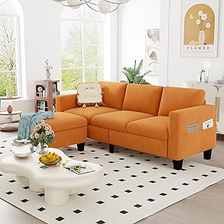
ZeeFu Convertible Sectional Sofa Couch,Classic 3 Seat L-Shaped Sofa Set …

MIULEE Pack of 2 Couch Throw Pillow Covers 18×18 Inch Soft Aqua Green Ch…
nuLOOM 6×9 Rigo Jute Hand Woven Area Rug, Natural, Solid Farmhouse Desig…
Conclusion

Revamping your space with these Rococo color schemes can truly invigorate your home.
Whether you lean towards pastels or bold hues, the potential to create something beautiful is limitless. Don’t hesitate to mix and match these ideas to reflect your unique style. Allow your creativity to thrive with these vibrant colors that carry the spirit of Rococo into the modern era.
Note: We aim to provide accurate product links, but some may occasionally expire or become unavailable. If this happens, please search directly on Amazon for the product or a suitable alternative.
This post contains Amazon affiliate links, meaning I may earn a small commission if you purchase through my links, at no extra cost to you.
Frequently Asked Questions
What Are Rococo Color Schemes and How Can They Enhance My Space?
Rococo color schemes are inspired by the elegant and ornate design style of the Rococo period. They typically feature pastels and bold hues that create a sense of luxury and charm. By incorporating these color combinations, you can transform your space into a vibrant yet sophisticated environment that reflects your personal style. Think soft lavenders, rich sapphire, or fresh coral and turquoise for a delightful update!
Can I Use Rococo Color Schemes in Modern Decor?
Absolutely! Rococo color schemes can seamlessly blend with modern decor, bringing a unique twist to contemporary spaces. By mixing bold hues with neutral tones or integrating pastels in accents, you can achieve a chic and inviting atmosphere. Experiment with combinations like blush pink and charcoal or mint green and peach to create a captivating fusion of styles!
What Are Some Tips for Choosing the Right Rococo Color Scheme for My Room?
Choosing the right Rococo color scheme depends on the mood you want to create and the room’s purpose. Consider using soft pastels in spaces meant for relaxation, like bedrooms or reading nooks. For lively areas, like dining rooms, opt for bolder choices such as fiery red and cream. Always test your colors in different lighting to see how they interact with your furnishings and decor!
How Do I Incorporate Rococo Colors Without Overwhelming My Space?
To incorporate Rococo colors without overwhelming your space, start with a neutral base. Use bold hues in moderation—think about accent walls, cushions, or artwork. Pair bright colors with soft pastels to balance the overall look. For instance, a rich sapphire sofa can be complemented by cream accents, creating a stunning focal point that doesn’t dominate the room!
What Are the Best Rooms to Apply Rococo Color Schemes?
Rococo color schemes can be applied in various rooms, but some work better than others. Living rooms and dining areas benefit from the elegance of combinations like blush pink and charcoal. Bathrooms and sunrooms can shine with soft seafoam green and gold. Ultimately, choose colors that resonate with you and match the room’s function, ensuring a harmonious and revitalizing ambiance!
Related Topics
Rococo color schemes
vintage decor
pastel colors
bold hues
interior design
home revitalization
color combinations
decor tips
elegant spaces
room makeovers
traditional style
easy updates